
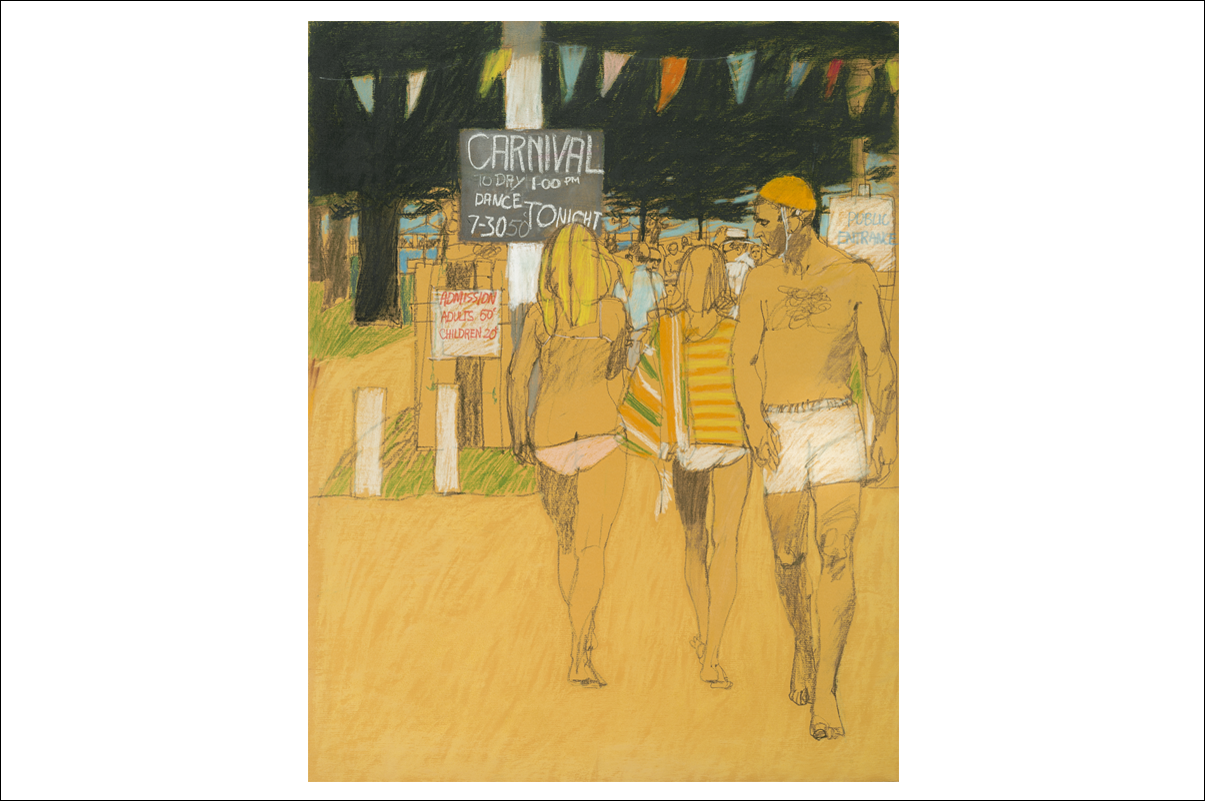
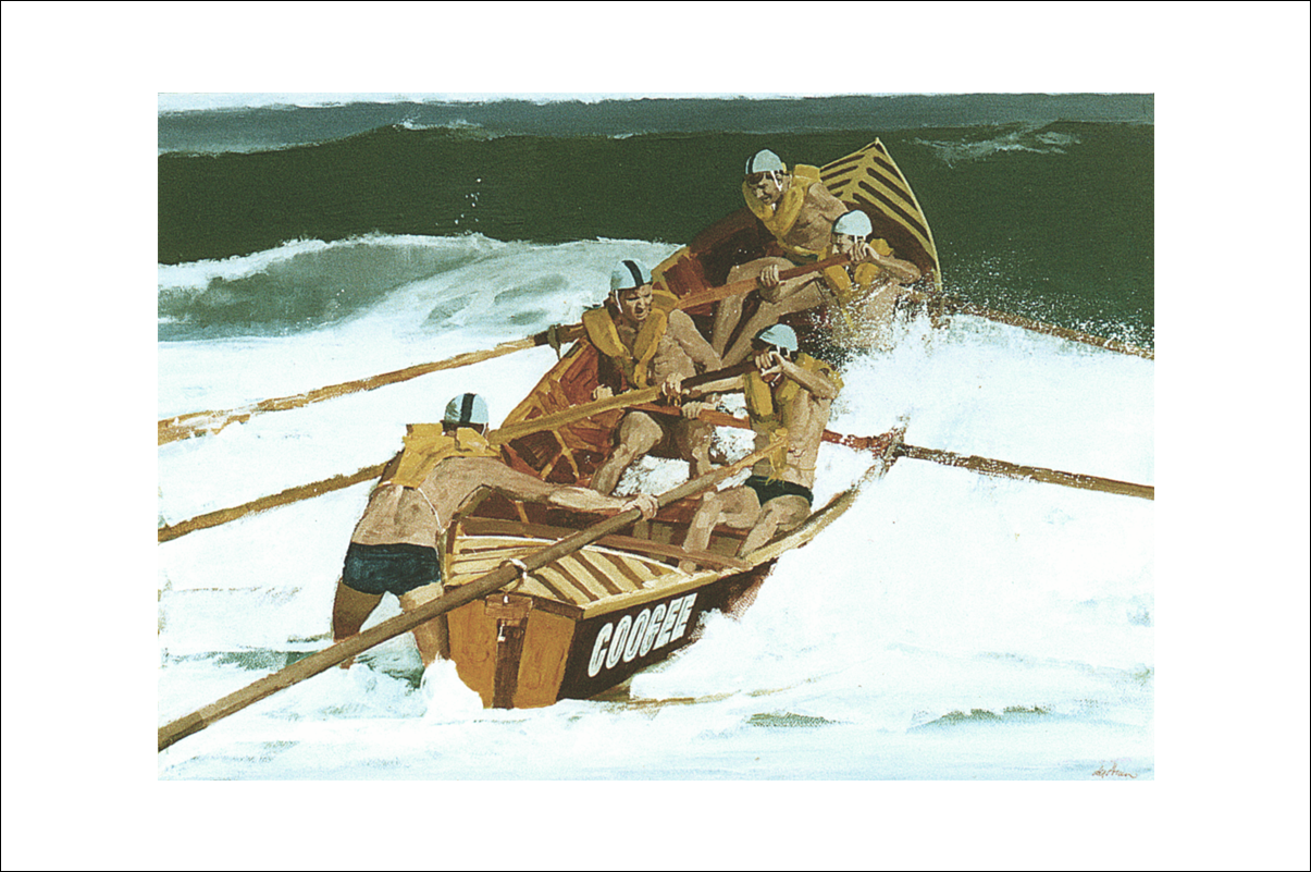
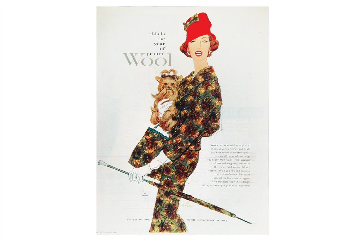
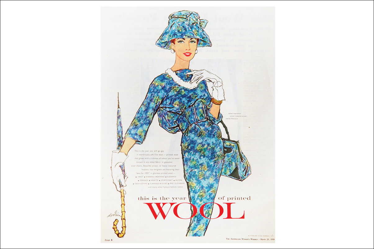
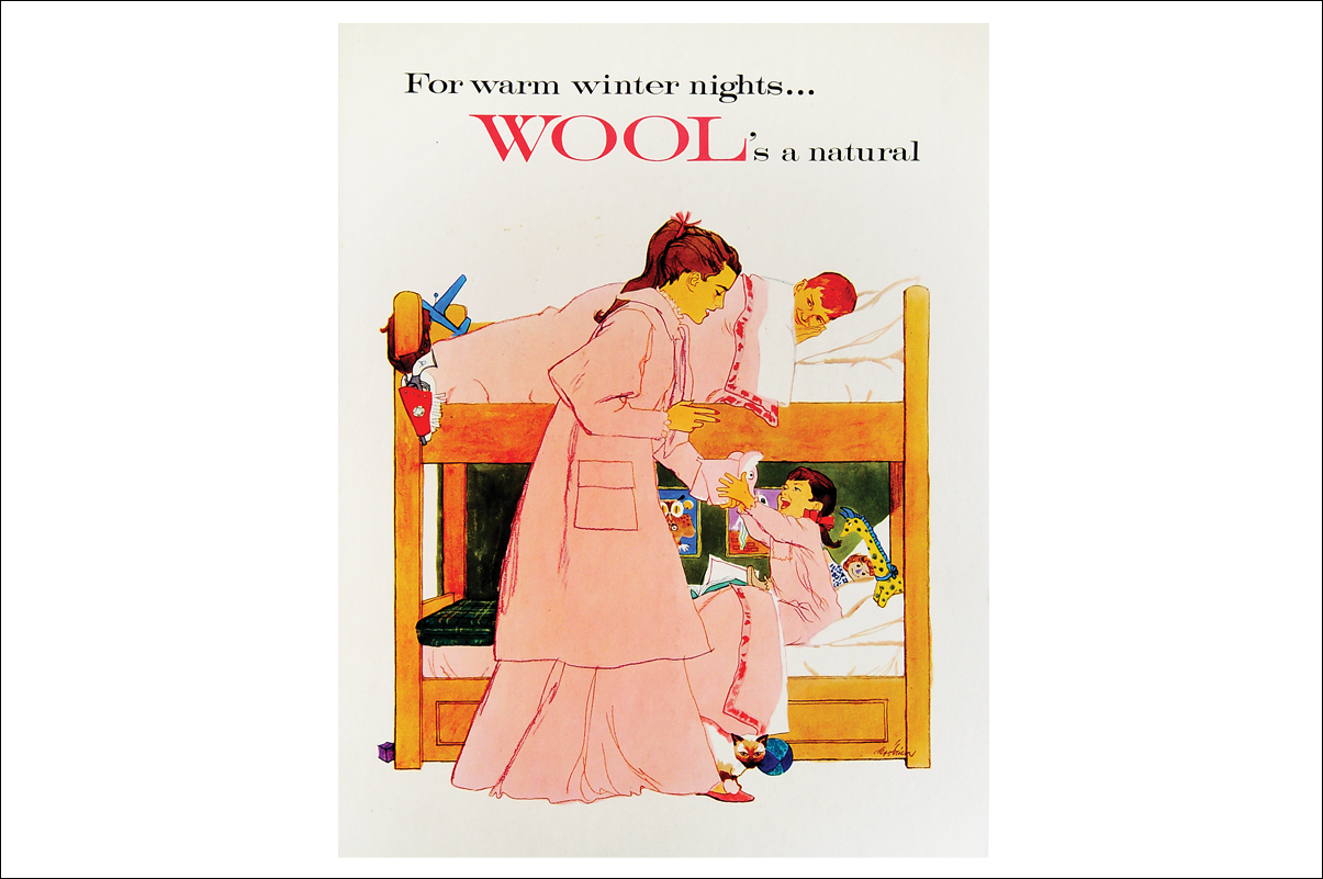
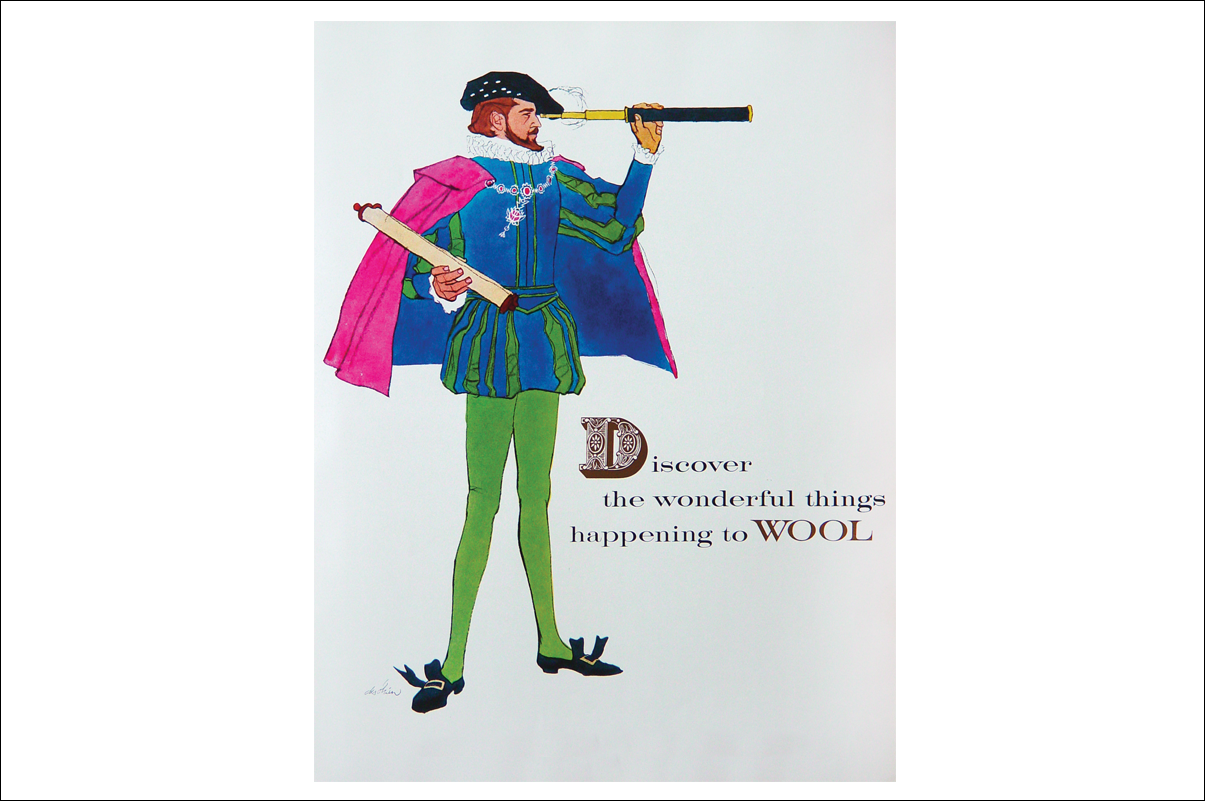
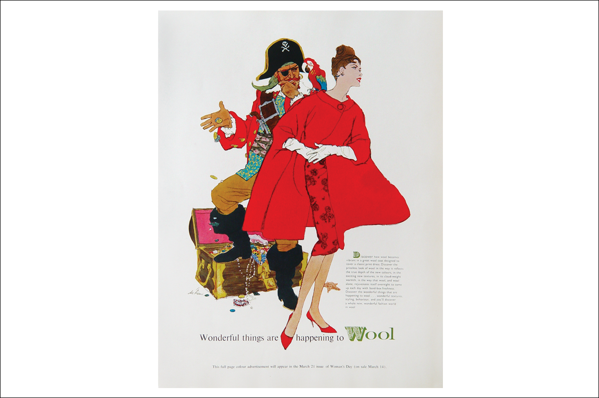
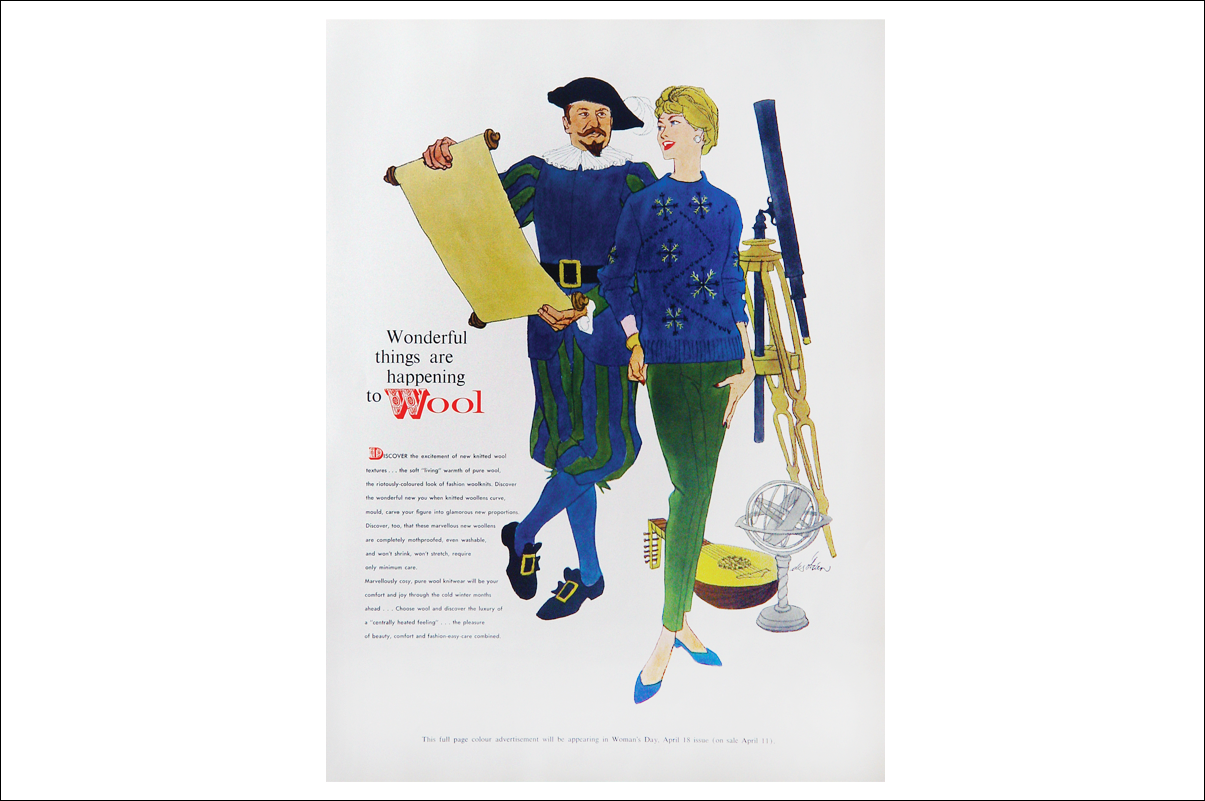
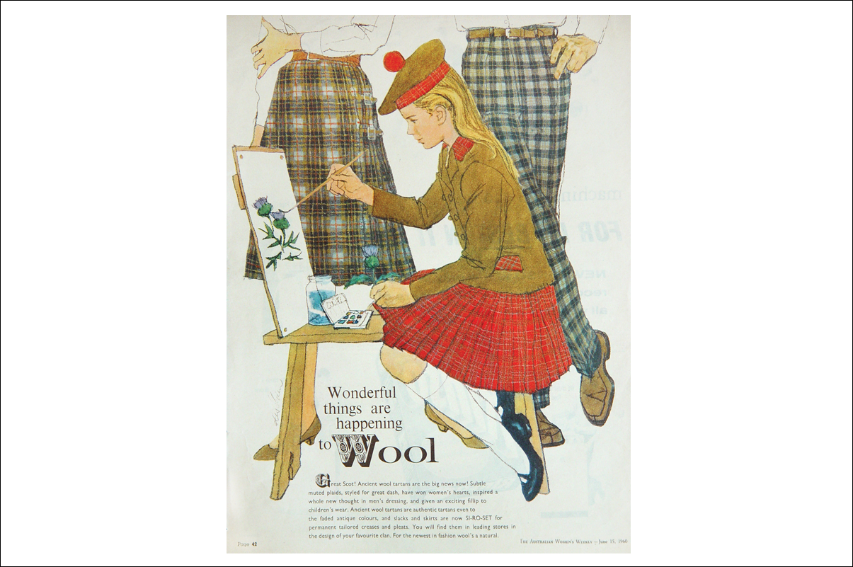
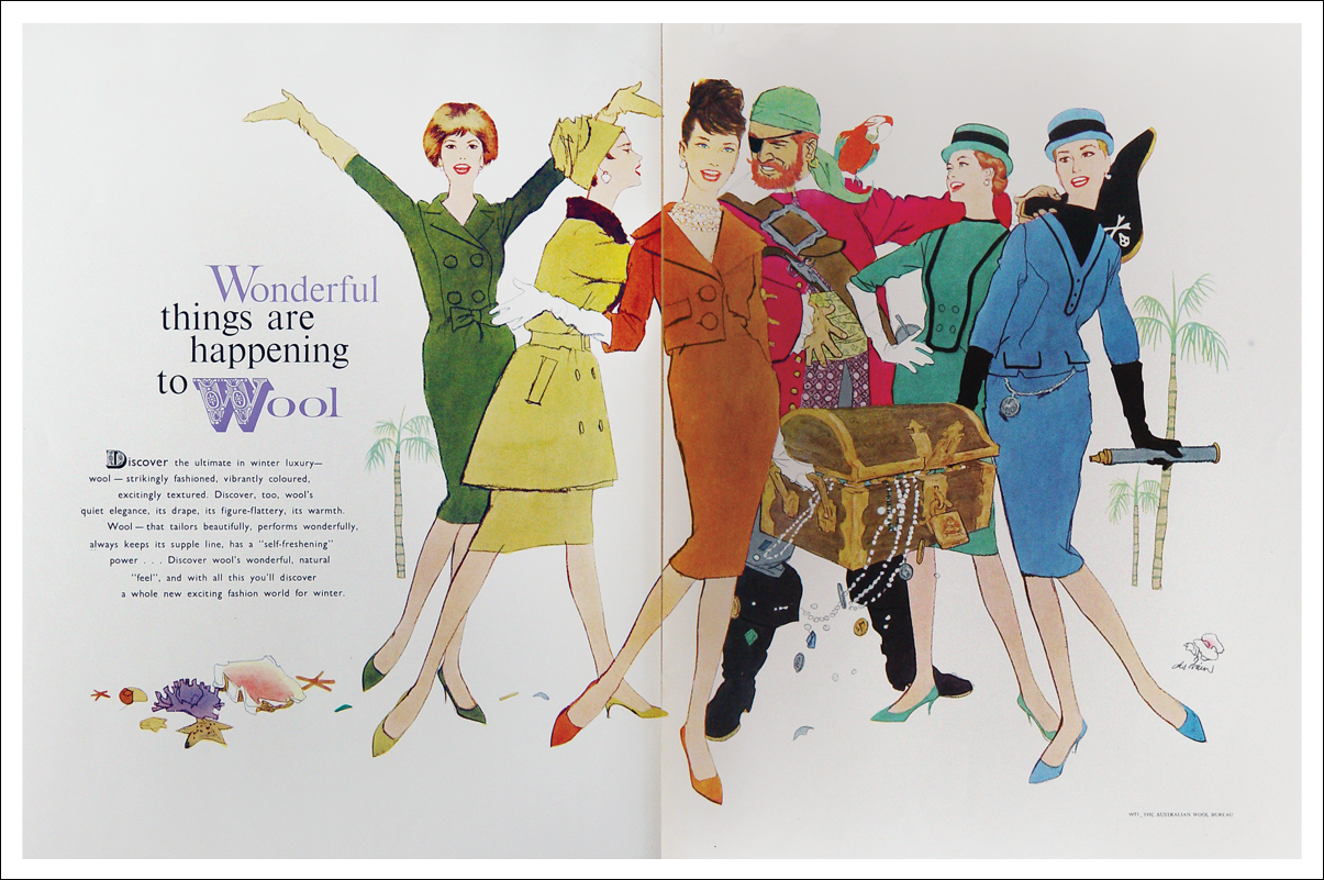
Wonderful things are happening to WOOL
Click arrows to scroll
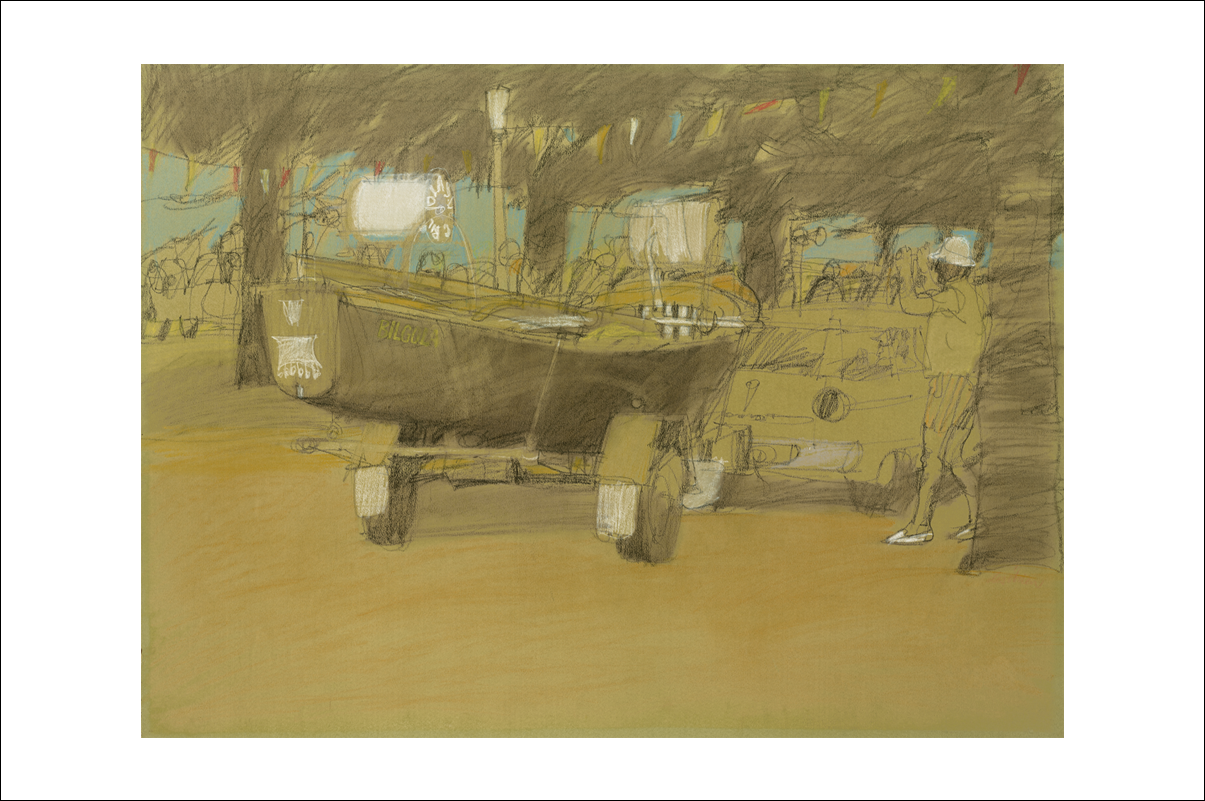
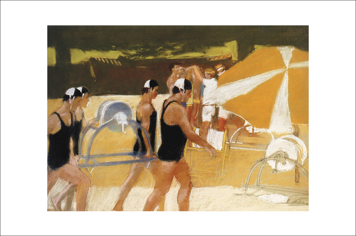
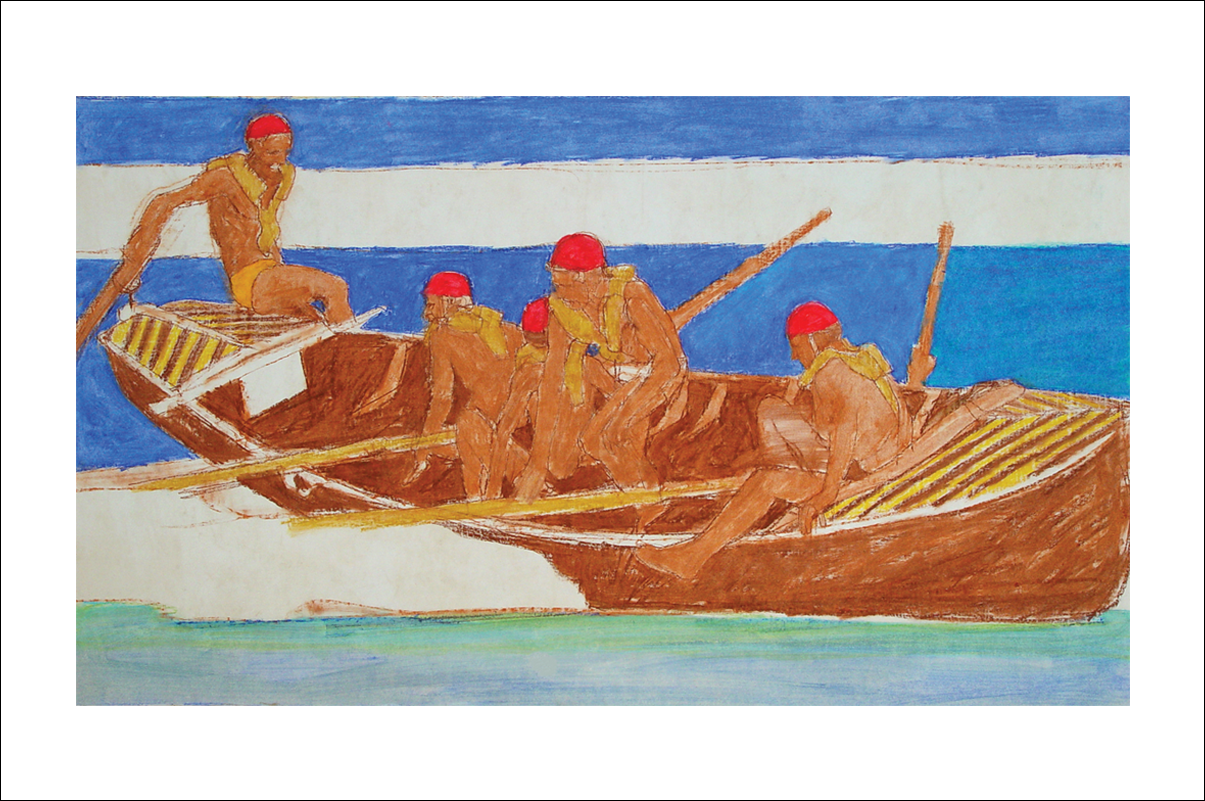
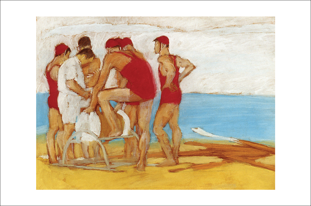
Excerpt from Ephemeral Aesthetics: Garments made of synthetic fibre or mixed with natural fibre were all the rage. As a result the Wool Bureau was struggling to keep its market share. They wouldn’t approve of any percentage of synthetic fibre blended with wool, and therefore were fast losing (and in some cases had lost) their market share.
The advertising campaign: Discover the Wonderful Things Happening to Wool was the creative premise employed to educate consumers of the natural properties and benefits wool possessed, through stylish, fashionable clothing in surreal situations.
I had the ideal arrangement with the wool campaign. A new agency, Ralph Blunden Advertising was formed to give wool a completely new image: focusing on the end product, instead of sheep and shearing. We first did Printed Wool, then Wool’s a Natural, and Wonderful Things are Happening to Wool.
I did everything except write the copy: art direction, layout, typography and conceived the illustrations. The copy was written last to the amount indicated on the layout. We aimed to have the ads noticed, with illustrated themes, in a technique suitable for the fabric, to give a strong visual identity throughout.
Discover these images and more in the book Des O'Brien – Ephemeral Aesthetics.
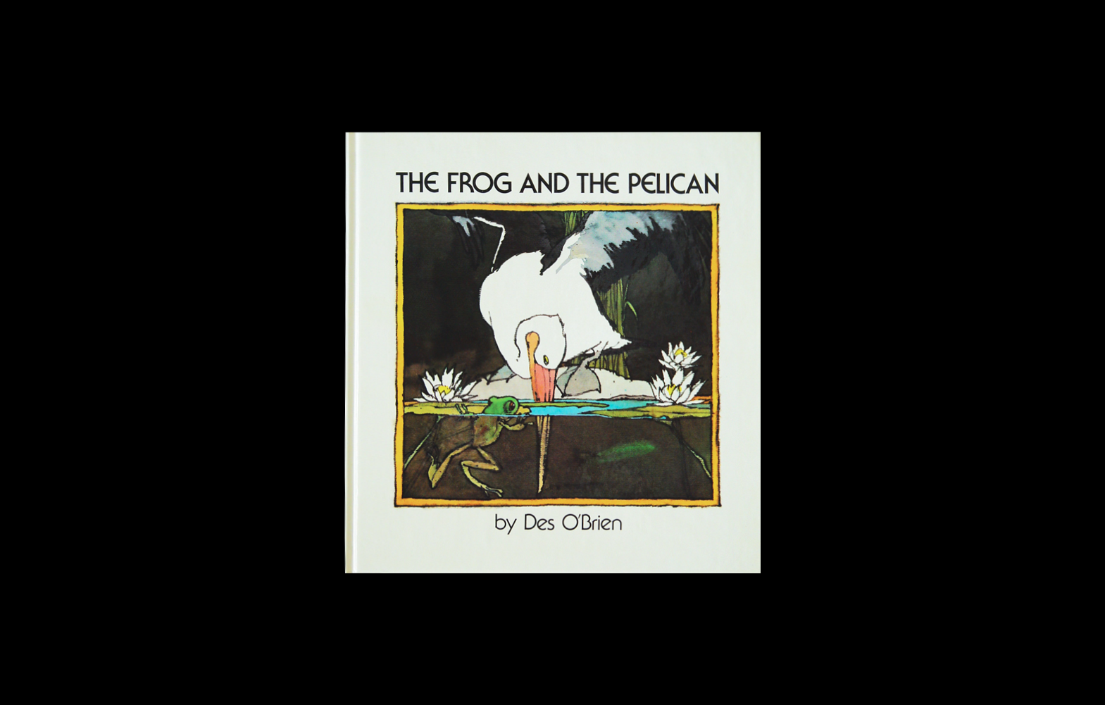
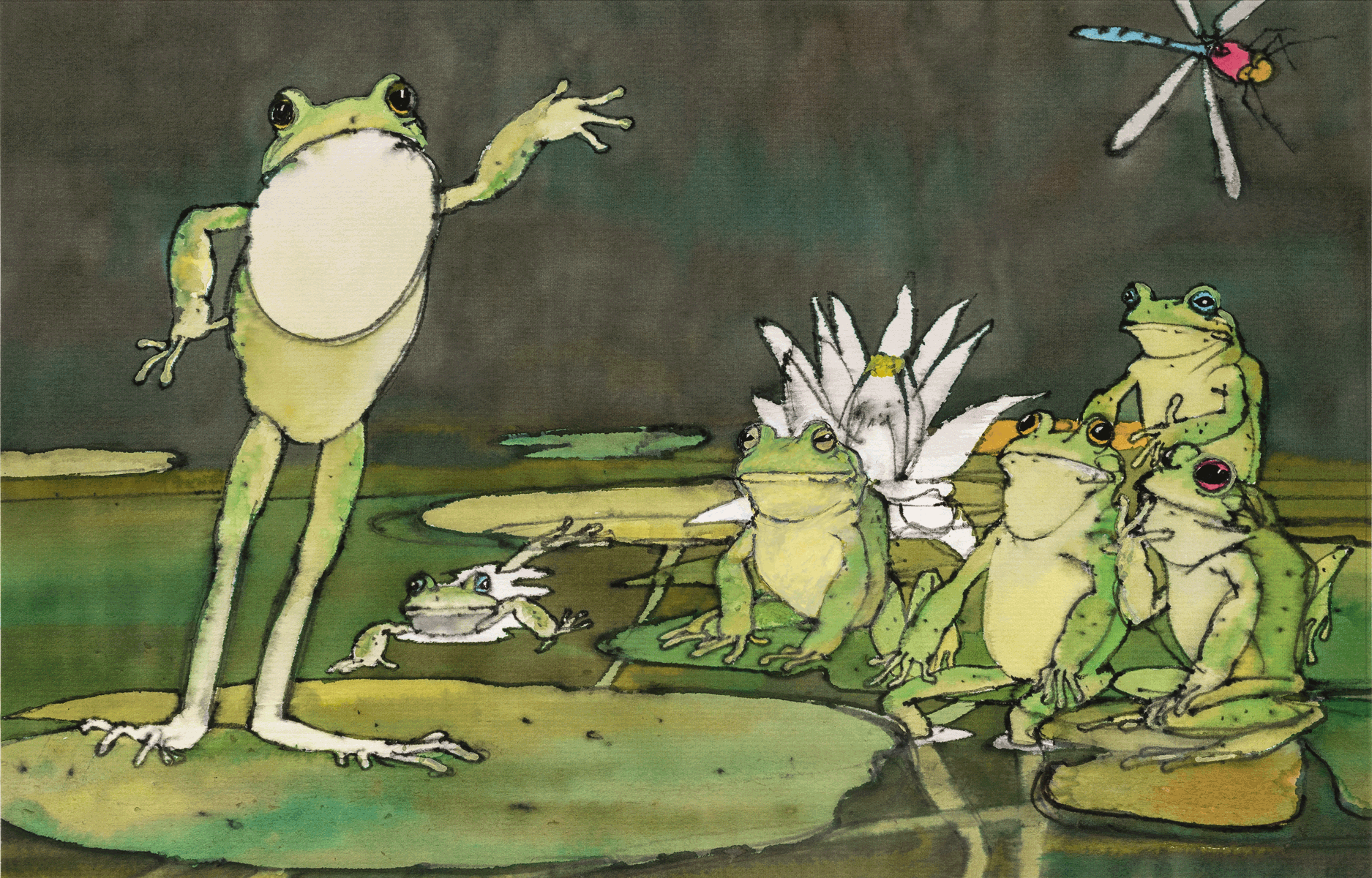
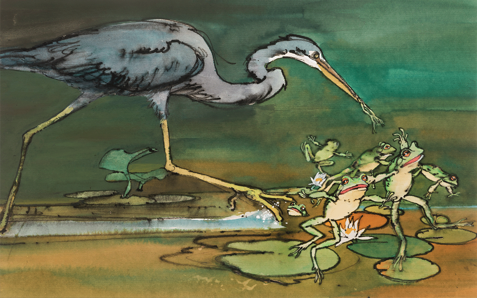
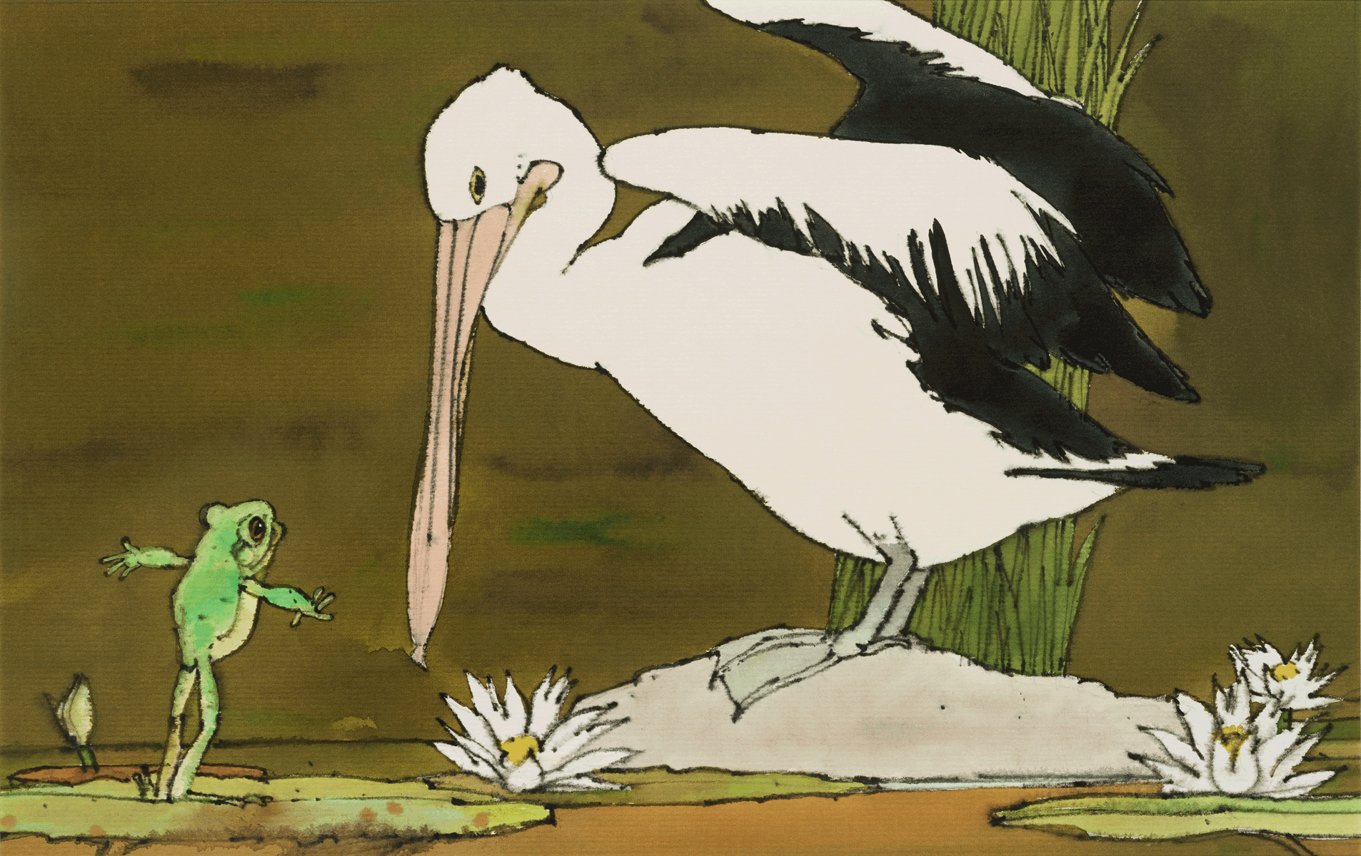
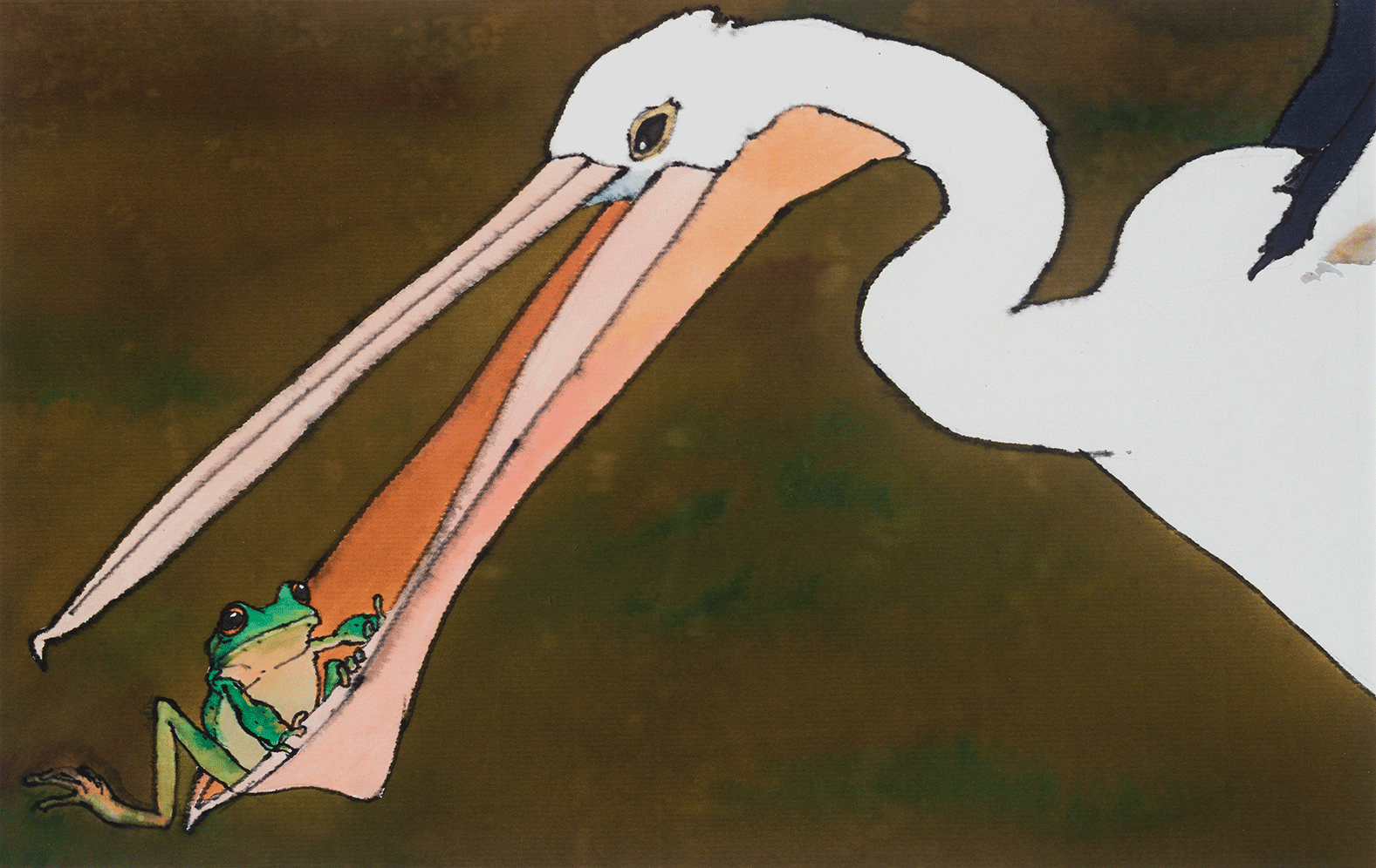
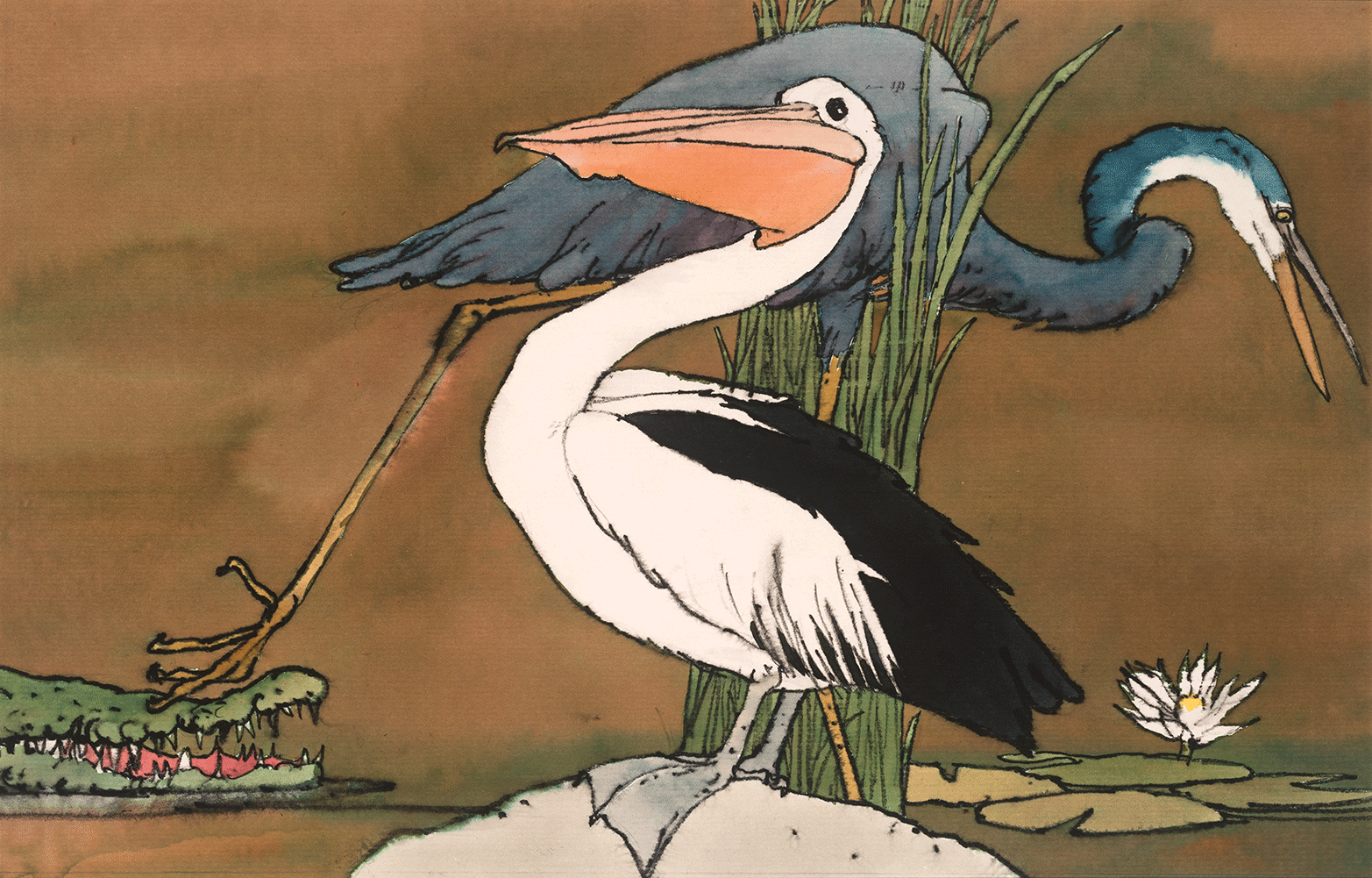
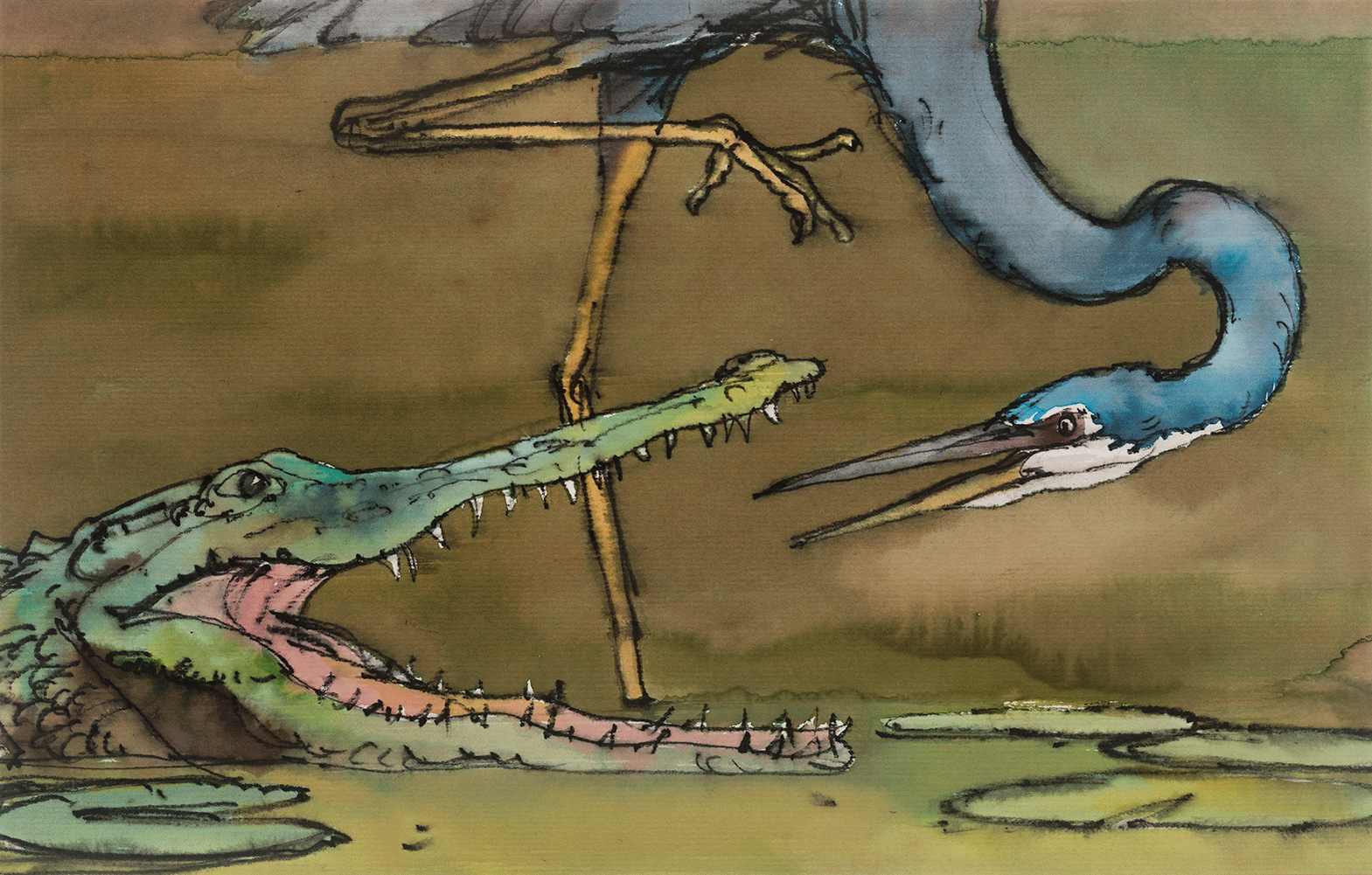
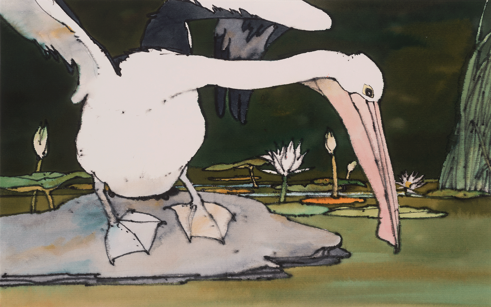
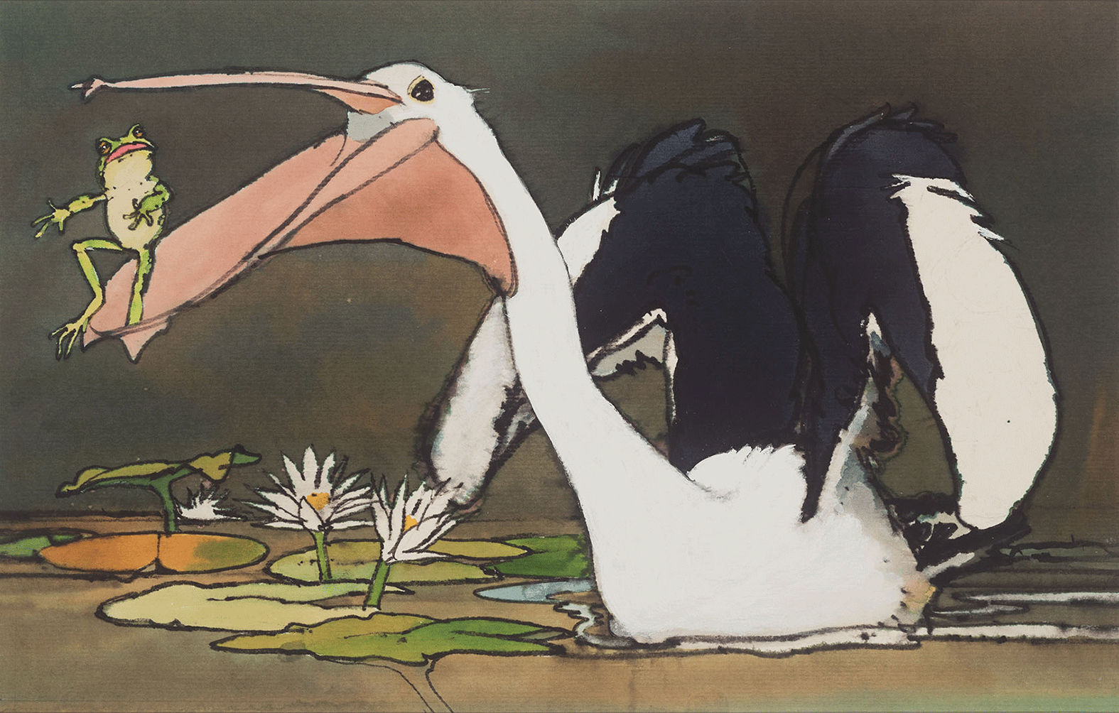
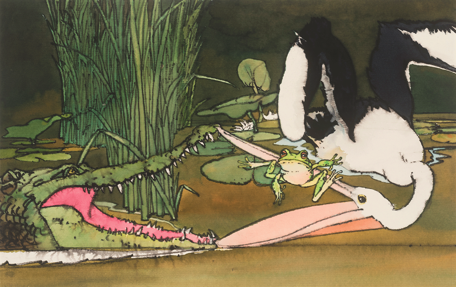
The Frog and the Pelican
Click arrows to scroll
The Frog and the Pelican by Des O'Brien
The enduring illustrated children’s books are those where writer and artist are one and the same. With his children’s book, The Frog and the Pelican, Des set out to do a book without words and to draw the characters with some human characteristics and expressions. As it turned out the illustrations act as a visual narrative that elucidates the text, but are not dependent on it and can be visually imagined by most youngsters using their own words to tell the story.
Awarded a medal by the Leipzig Art Gallery Director, Germany. And the Australian Book Publishers, best children’s book design award, 1981. First published by Methuen, 1981. Currently out of print with plans to re-publish.
For the first time, two of these delightful images are now available in print form from the Store at Des's request.
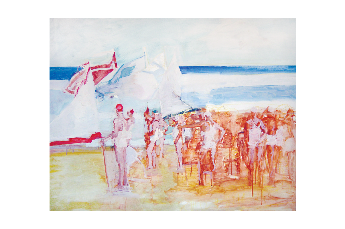
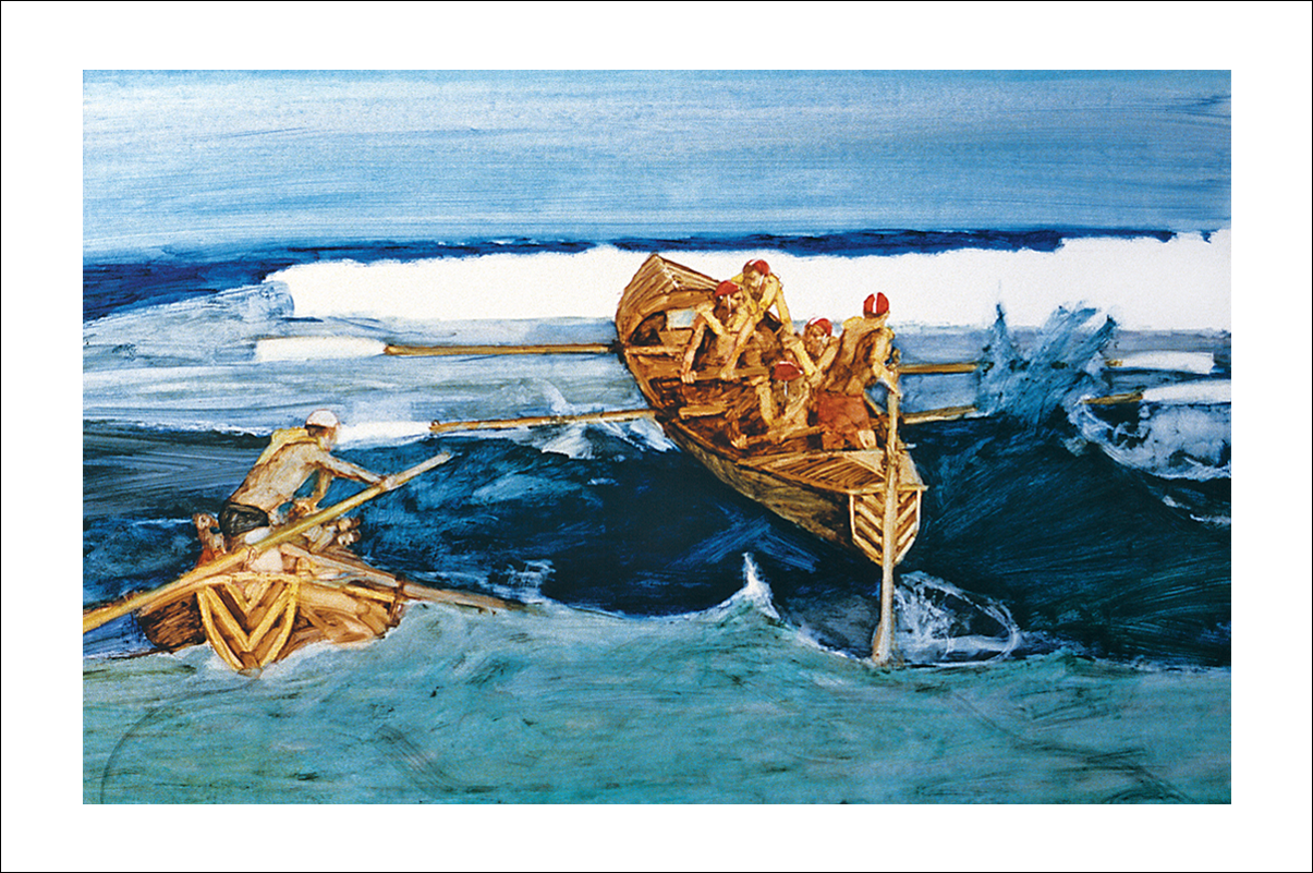
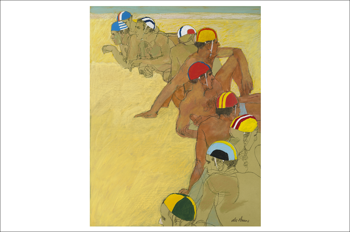
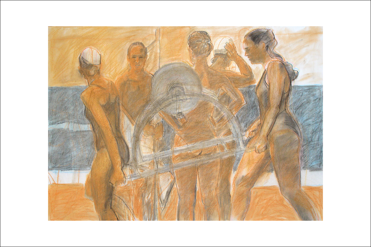
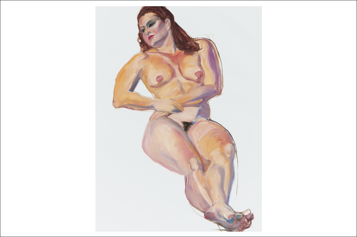
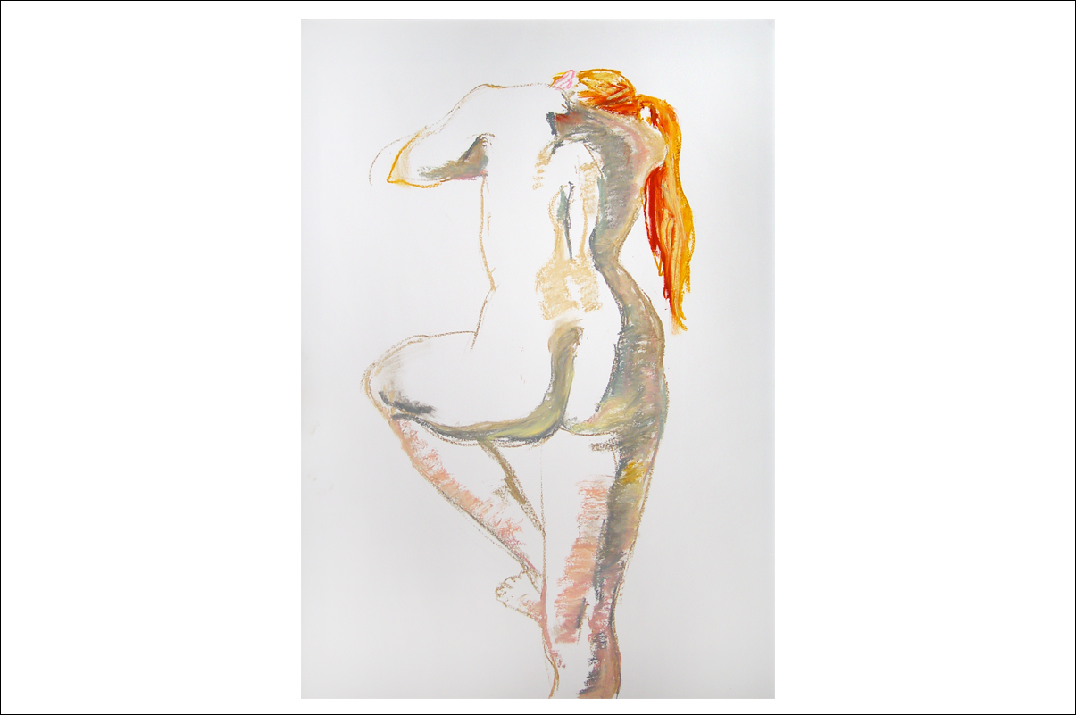
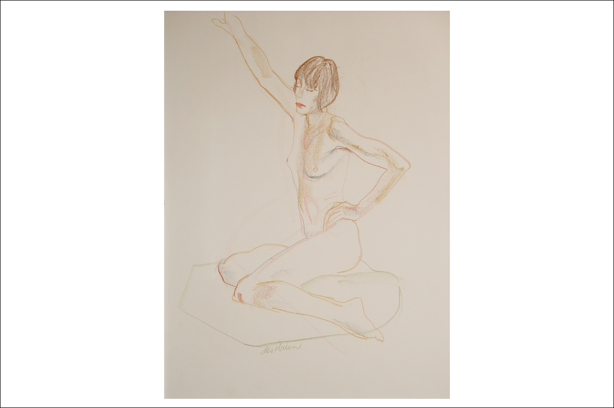
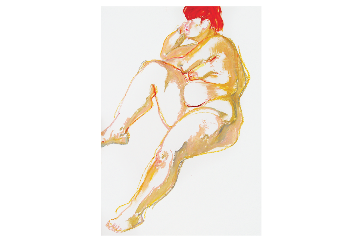
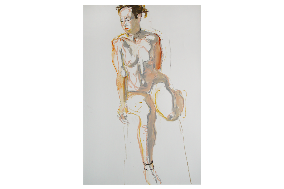
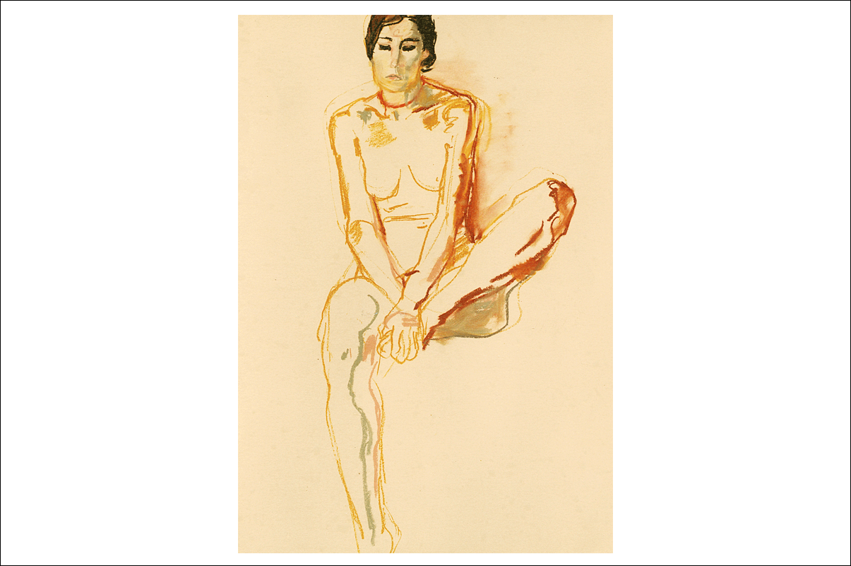
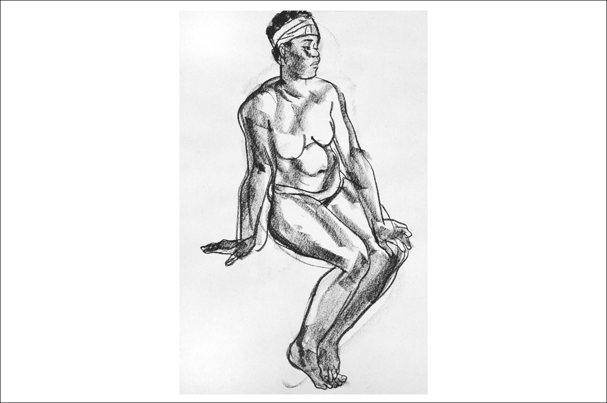
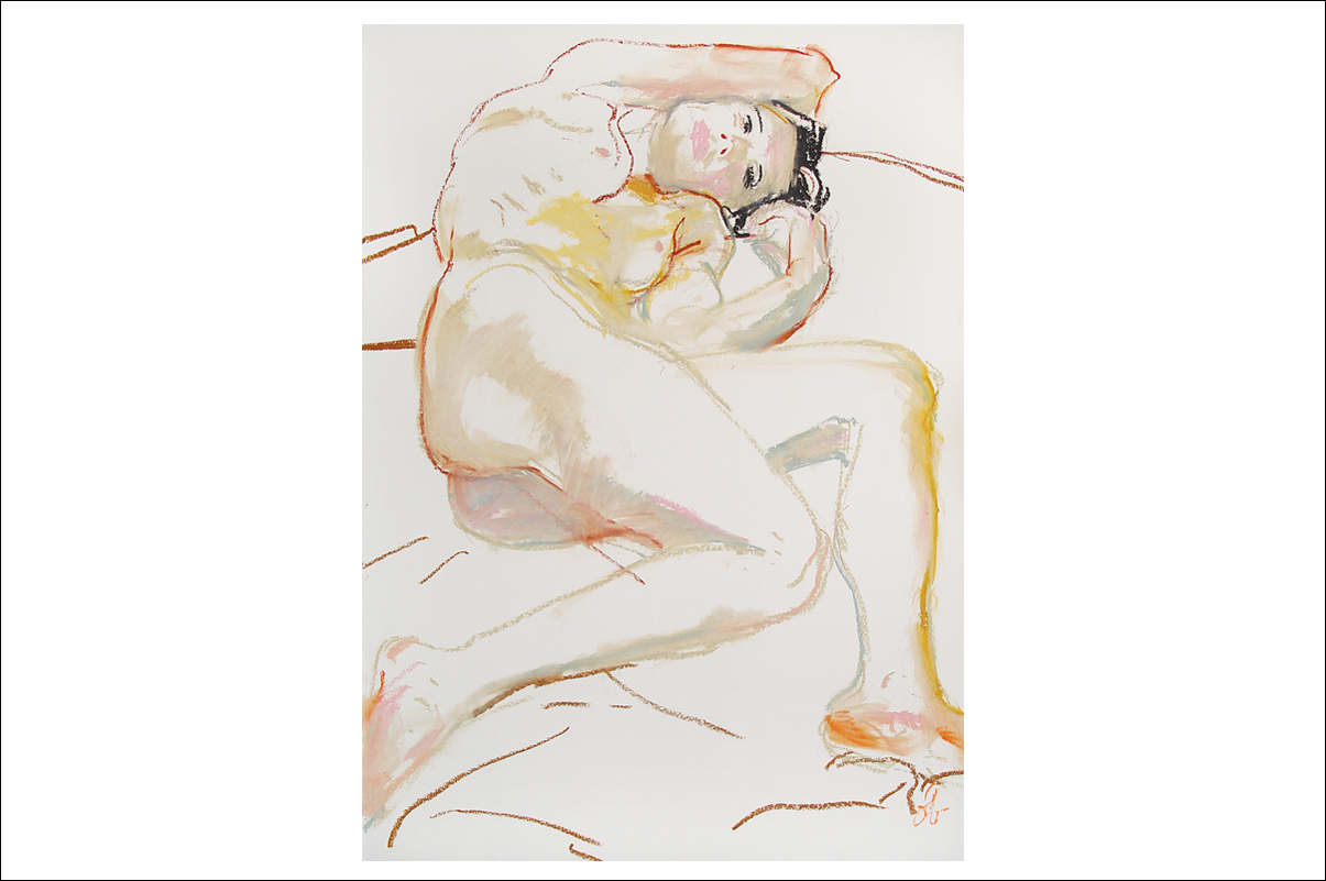
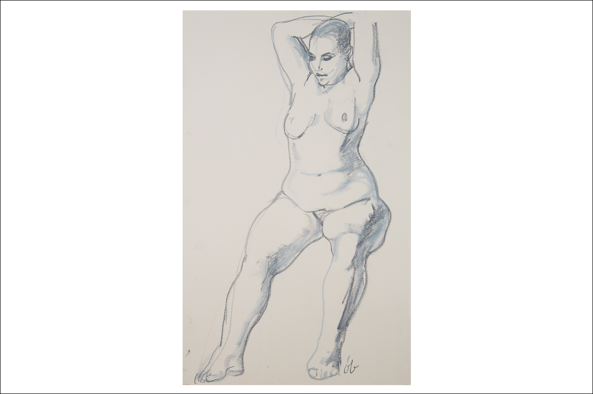
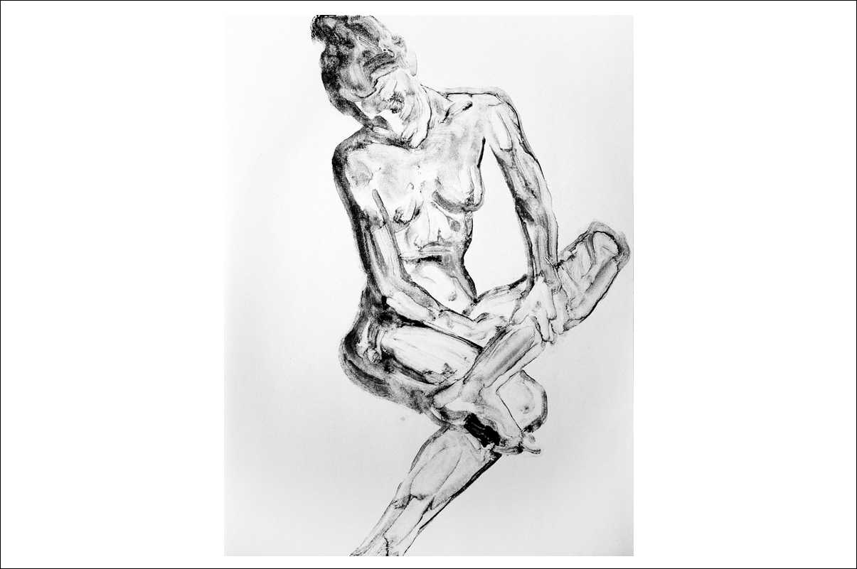
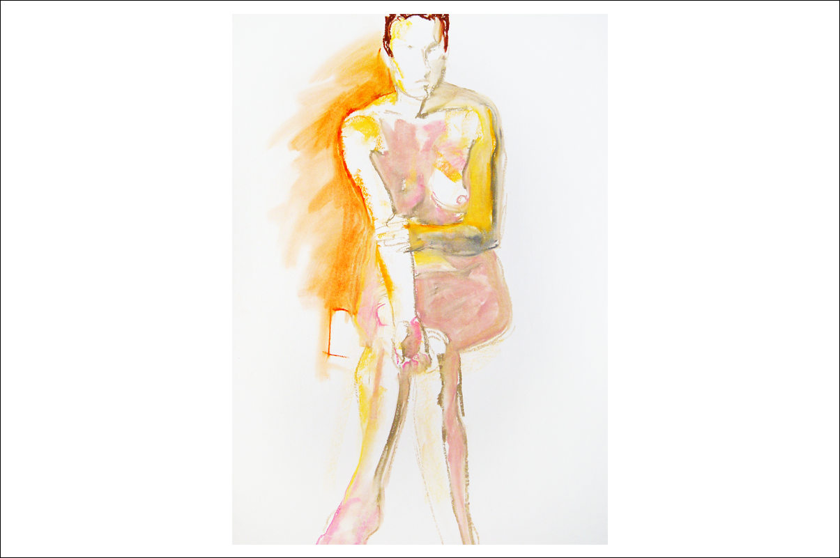
Nudes
Click arrows to scroll
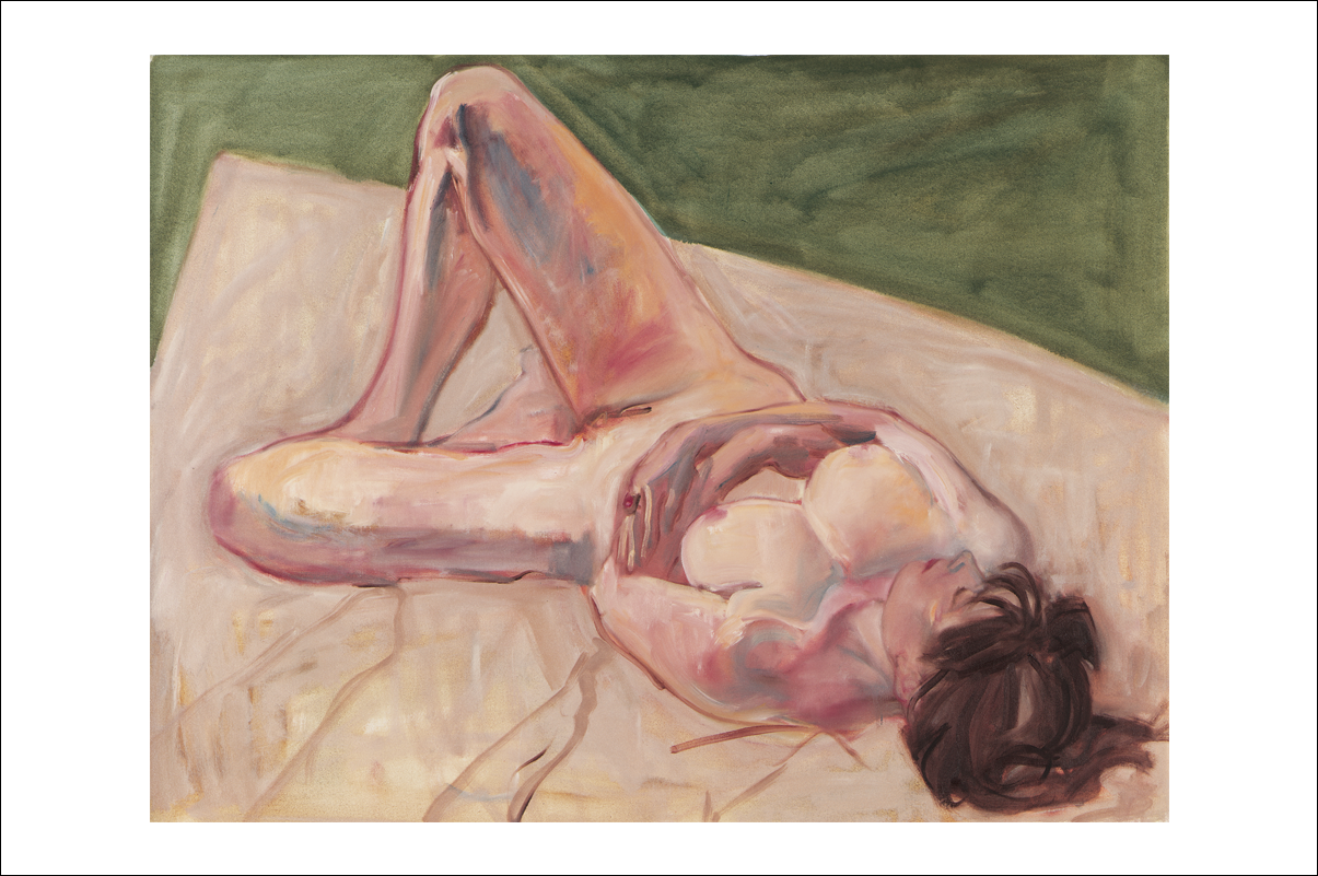
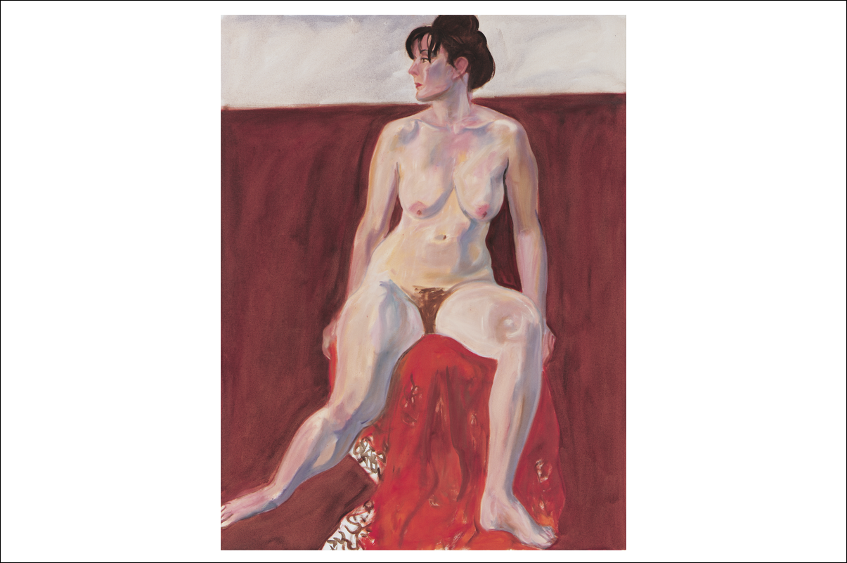
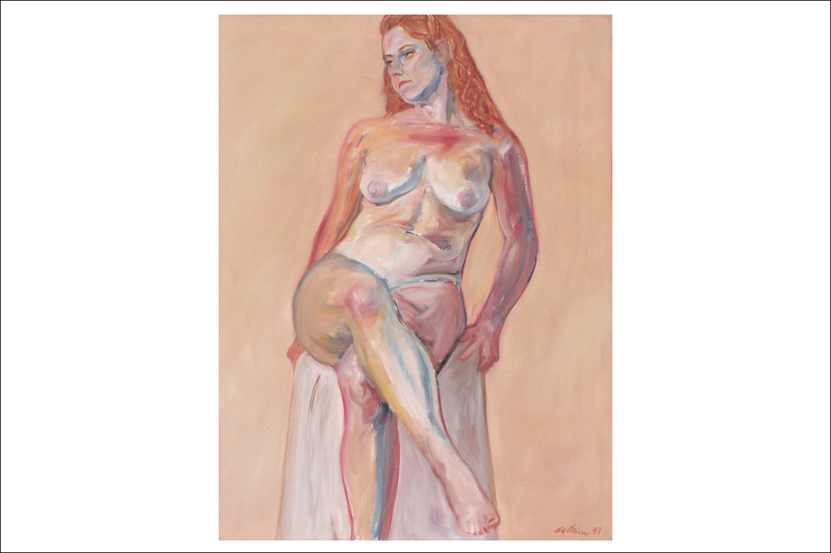
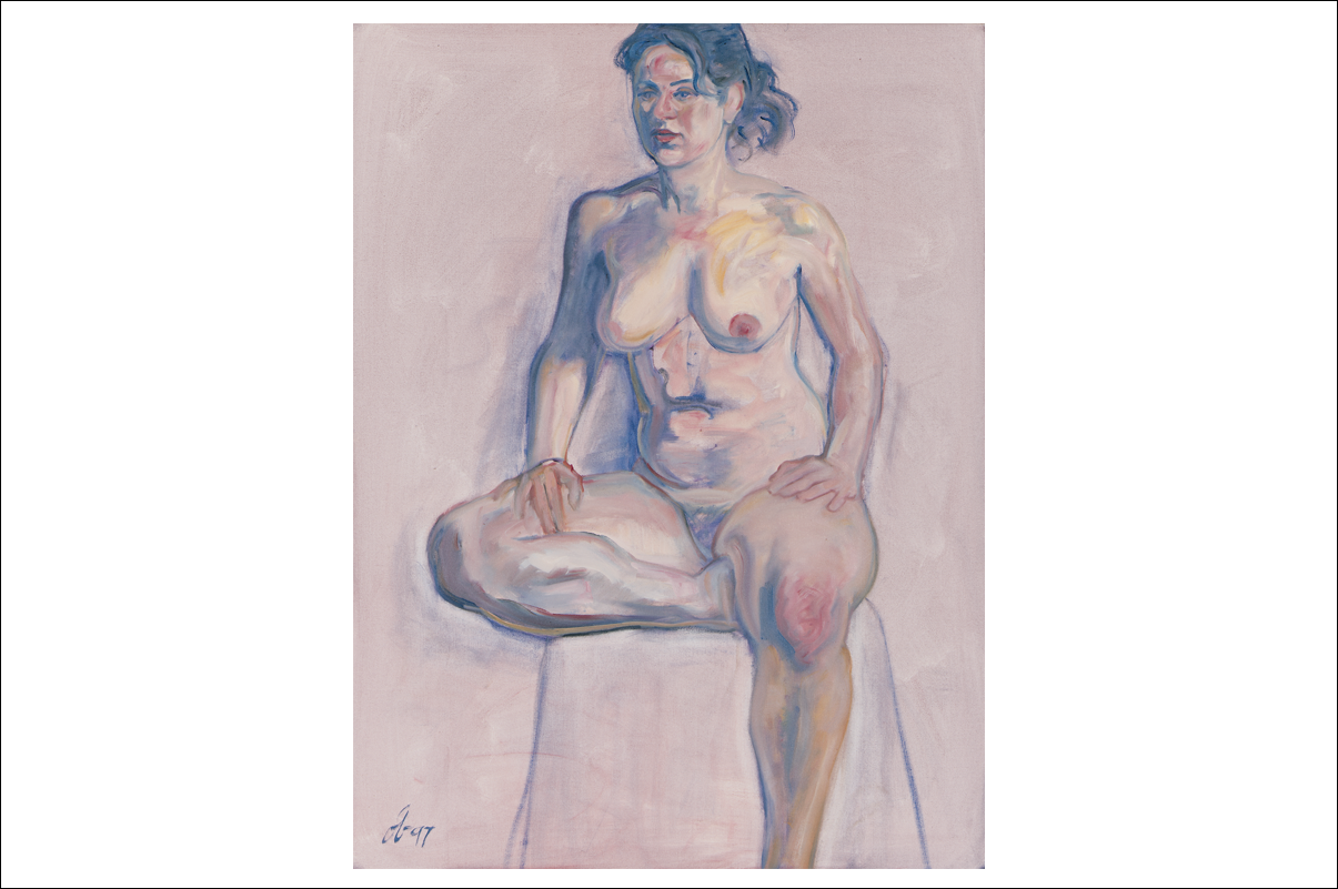
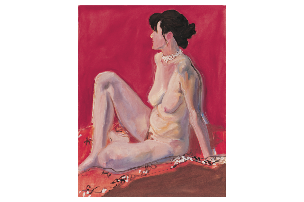
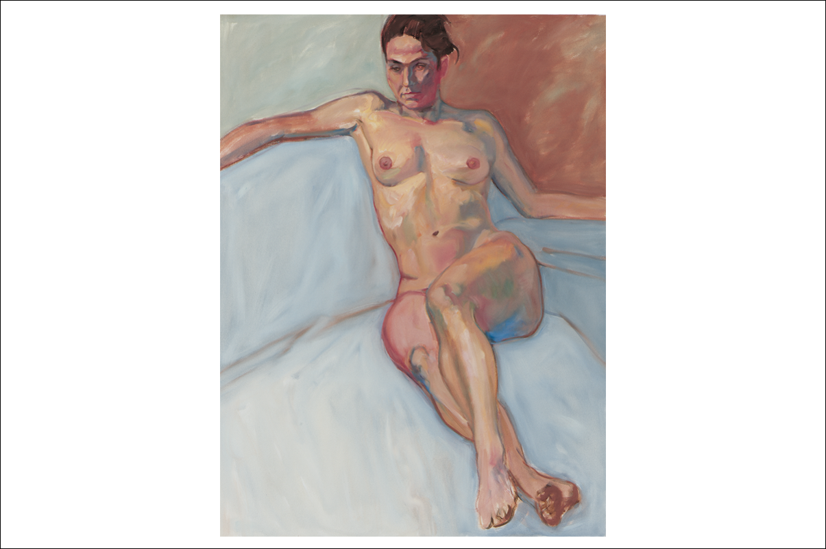
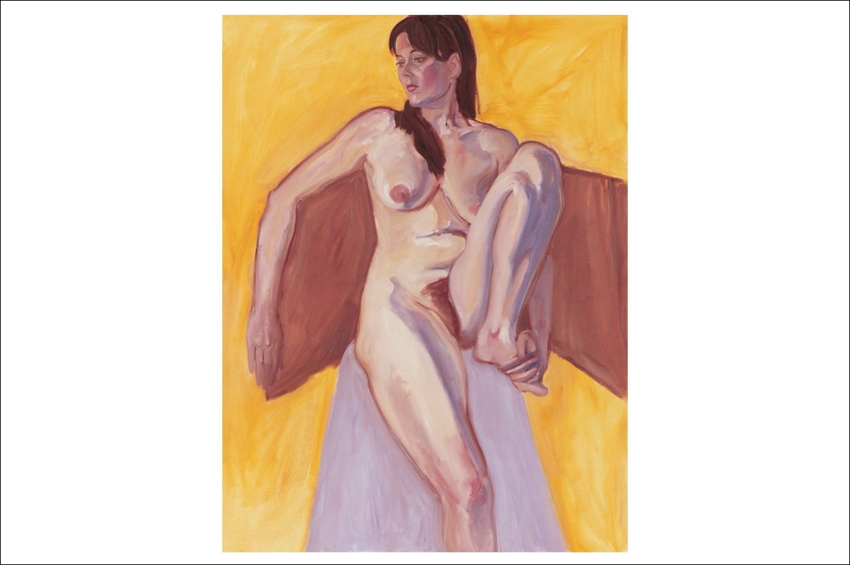
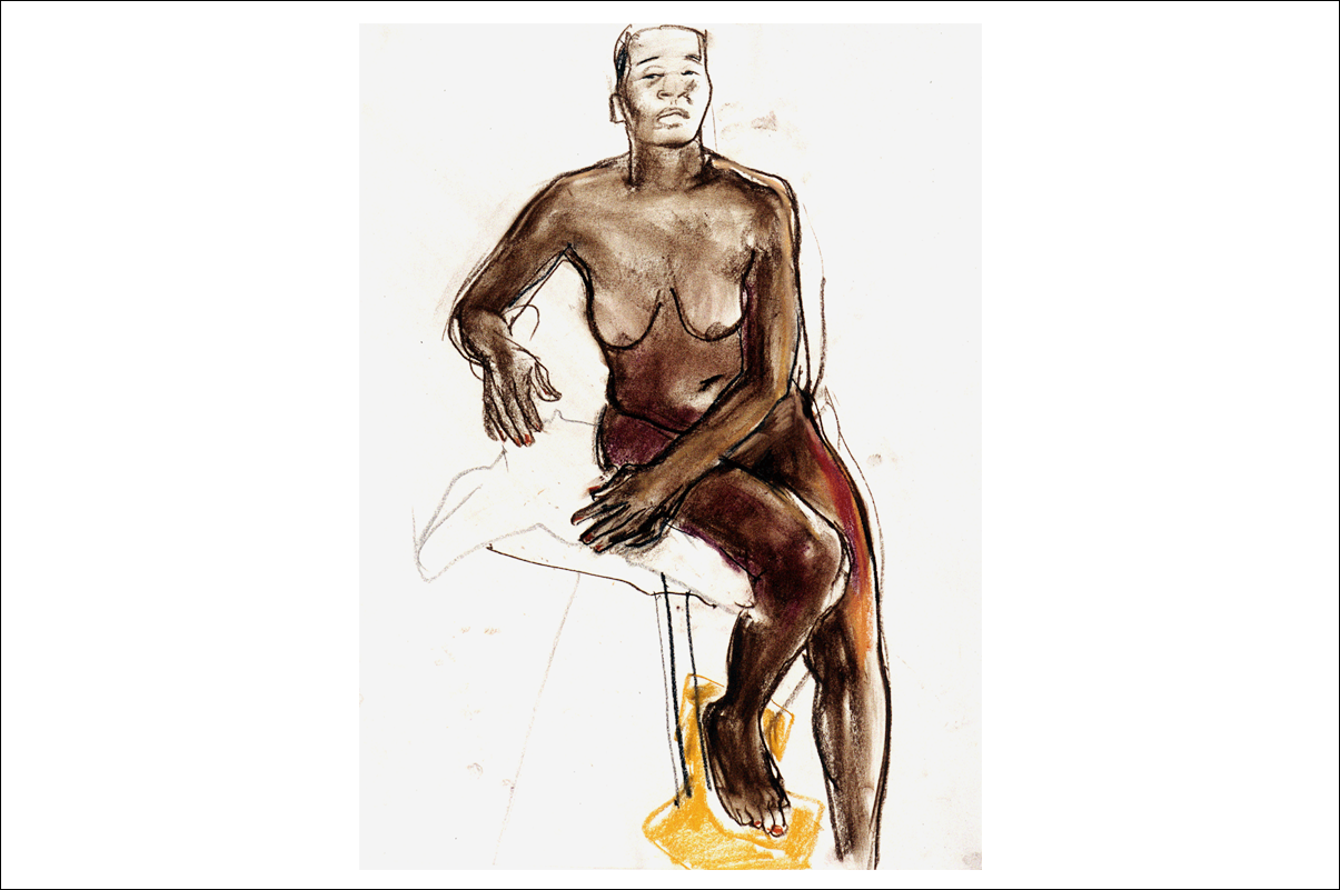
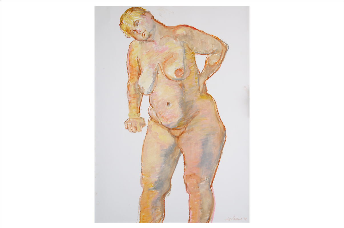
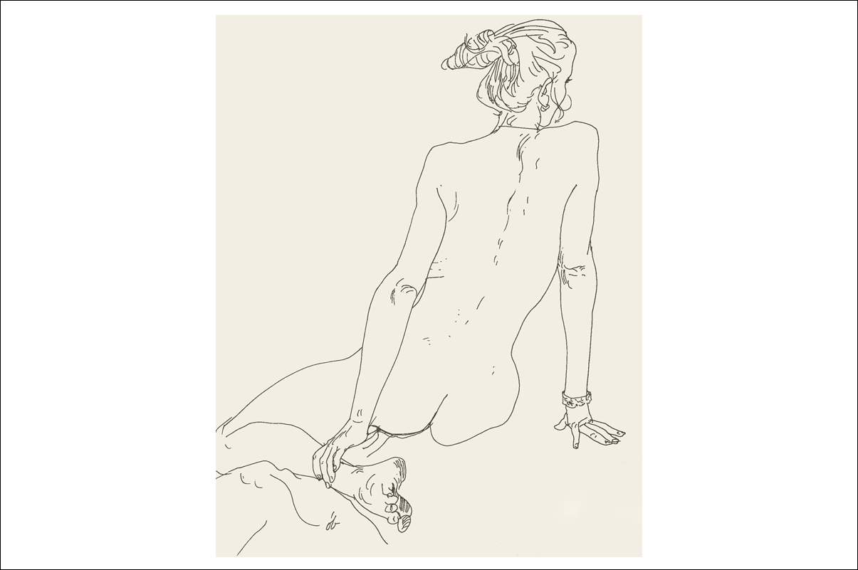
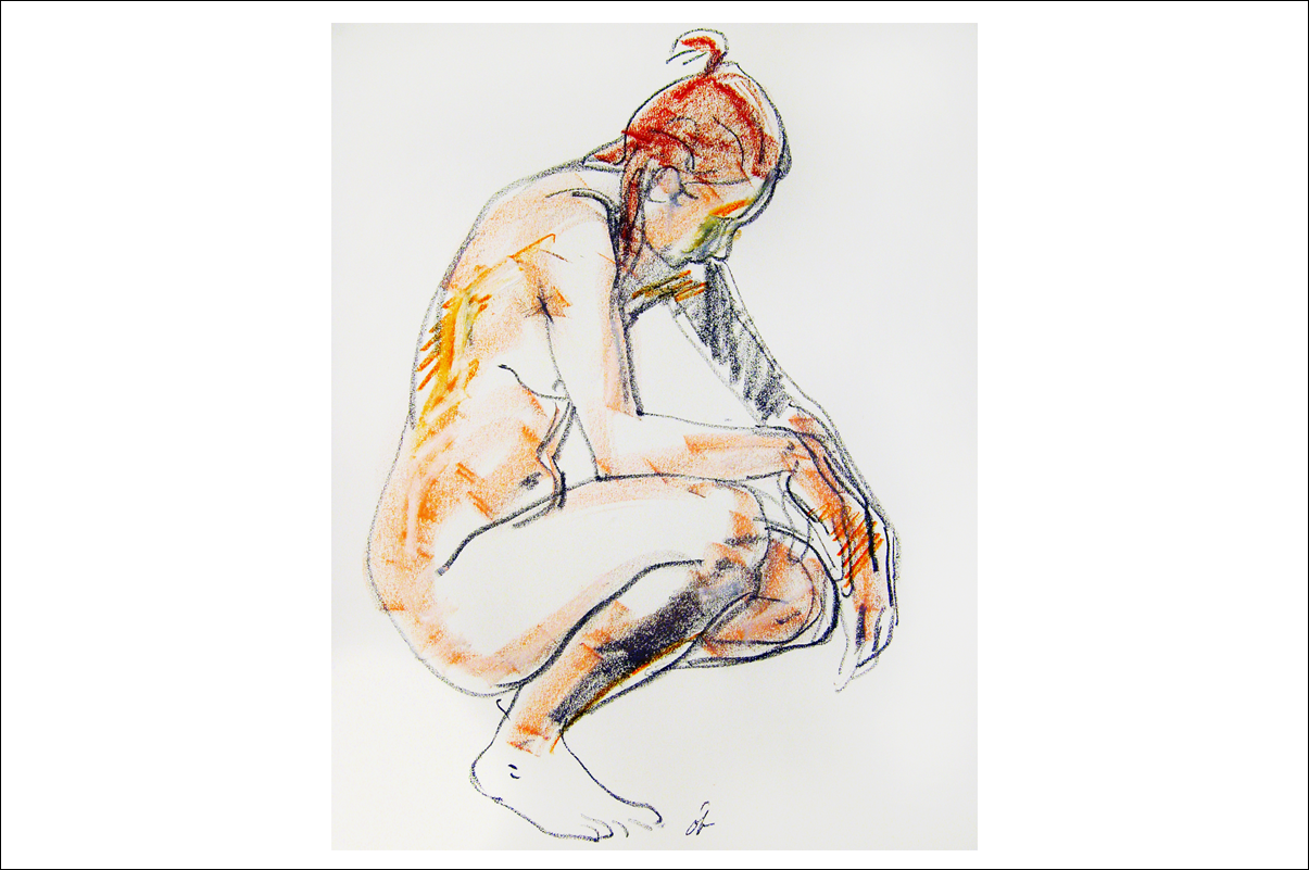
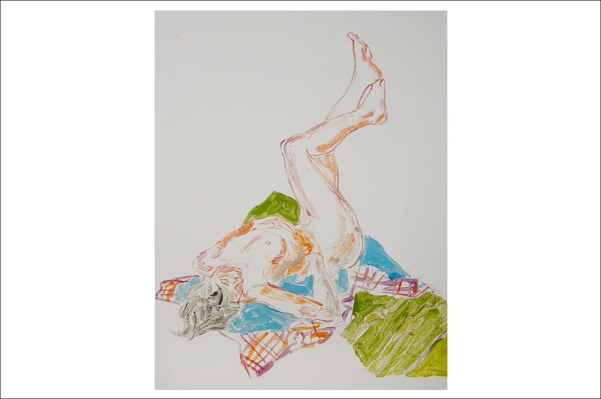
A master draftsman with a seemingly effortless ability to capture form. Figurative drawings and paintings held a strong focus for Des, with a period spanning a good ten years from the mid nineties becoming quite prolific. Weekly sessions during this time with contemporaries including Dick Watkins, were inspiring and productive. One project to evolve from this time is an instructive book on figure drawing which we hope to publish.
"The figure paintings displayed here are presented in a classic form that moves between representation and interpretation, never moving far from naturalistic vision. Pointed rather than exaggerated in their description, their clear contours achieve both volume and mass with clarity and directness." – Des O'Brien
Although Des practiced both figuration and abstraction simultaneously, from 1995 Des concentrated almost exclusively on painting the human figure. These sophisticated works have a vitality and excitement that comes from the shear pleasure of drawing and painting.
Part of an exquisite body of work yet to be exhibited.
Postage Stamps
O'Brien & Horrex, the studio run by Des and wife/artist Jackie Horrex on Sydney's Northern Beaches, designed and illustrated over twenty Australian postage stamps. A prestigious engagement with Australia Post, and one which earned them critical acclaim.
Click images to enlarge
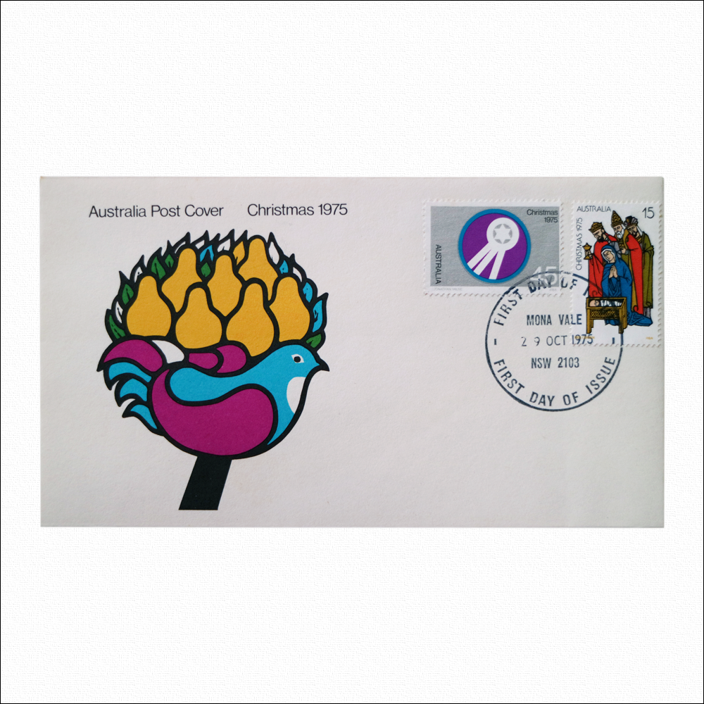


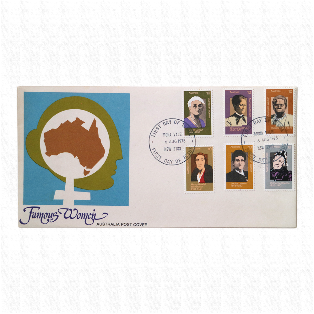


Shown here from top to bottom are:
Christmas 1975 The Nativity, portrayed in Byzantium fashion shows Mary kneeling beside the new-born Jesus asleep in a crib. The Magi, bearing gifts, approach in adoration. This was Des's first stamp commission.
Australian Famous Women This series was done together with Jackie. The commission was for two portraits of each woman to be painted in a naturalistic style suitable for stamp size reproduction together with the subjects name, date of birth, Australian Women, the denomination and Australia all in a legible typeface. The series brought Des and Jackie international recognition as postage stamp designers.
The stamp of Truganini was the first of its kind to feature an Australian Aboriginal woman.
Sports Series This was Des's first series stamp commission from Australia Post. "I was asked to employ a technique that drew attention to the body movements associated with each sport. Eventually a contour outline, giving descriptive emphasis to silhouettes, defined and enhanced by use of solid colour was chosen".
Olympic Games Series These were a team effort – a designer on the stamp committee, his two assistants and Des combined to produce the series. Des selected the poses and drew the figures. The streamlined 1930s Art Deco technique was chosen from an unused solution for the sports stamp series.